
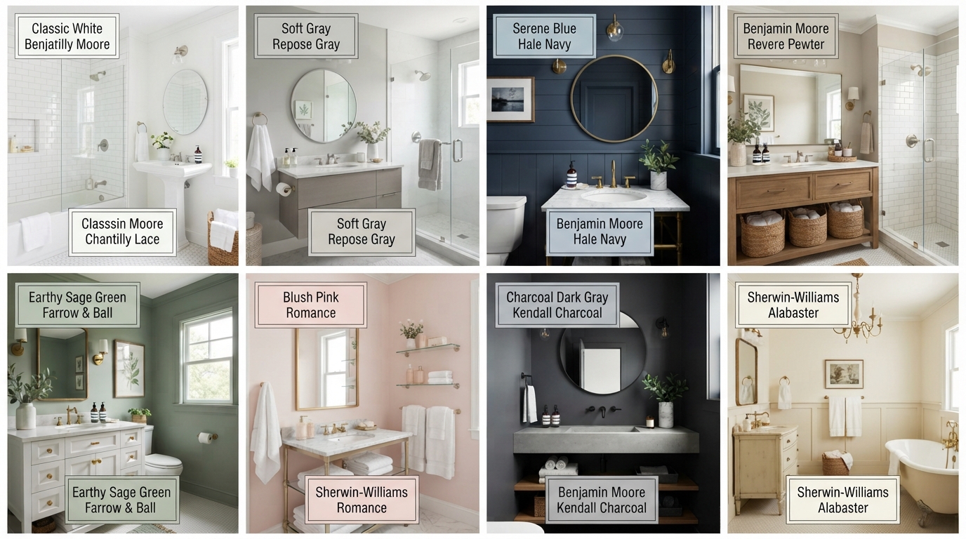
27 Bathroom Paint Color Ideas To Transform Your Space
When I want to refresh a bathroom without taking on a major renovation, paint is usually one of the first changes I consider. A new wall color can alter how bright, spacious, warm, or dramatic the room feels without replacing the vanity, tile, or fixtures.
I also pay attention to the bathroom’s natural light, size, flooring, and existing finishes before choosing a color. The same shade can look completely different in a windowless powder room compared with a bright bathroom filled with daylight.
I’ve gathered 27 bathroom paint color ideas ranging from soft neutrals and warm whites to rich blues, greens, pinks, purples, and dramatic dark shades. Each option can create a different mood and work with different decorating styles.
For small bathrooms, I usually look at light colors such as bright white, warm white, cream, barely-there gray, or pale blue. Larger bathrooms give me more freedom to experiment with deeper shades such as charcoal, black, cobalt blue, royal blue, or eggplant.
Save this for later
Table of Contents
Before I commit to a color, I always recommend testing a sample on the actual bathroom wall. Artificial lighting, daylight, tile undertones, and even the color of your flooring can change how paint appears.
Key Takeaways
- Light shades can help a compact bathroom feel brighter and more open.
- Dark paint can add depth and drama when balanced with good lighting.
- Warm whites and creams work well when a stark white feels too cold.
- Blue and green shades can create a calm, fresh bathroom atmosphere.
- Bold colors work especially well on an accent wall or in a powder room.
- I always test paint samples at different times of day before making a final decision.
Related article: 40 Small Bathroom Ideas to Make Your Tiny Space Feel Bigger
1. Sage Green
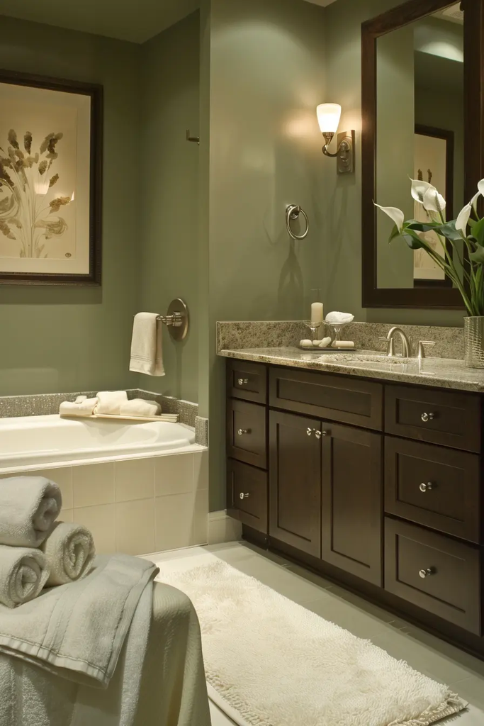
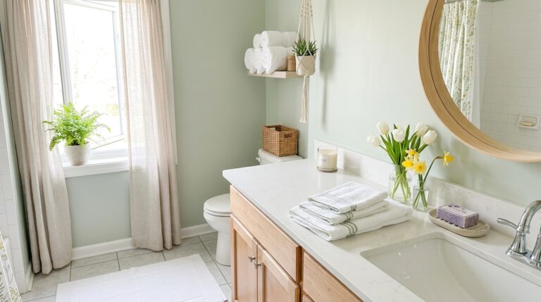
Sage green is one of my favorite choices when I want a bathroom to feel calm without looking plain. Its muted green undertone works beautifully with natural wood, white tile, brass fixtures, and woven accessories.
I find this color especially useful when I want to create a relaxed, nature-inspired bathroom. It can also soften a bathroom filled with hard surfaces such as ceramic tile, glass, and metal.
Pro Tip: If your bathroom receives limited daylight, test the sage shade first because some formulas can appear grayer or darker in low light.
2. Orange Sherbet
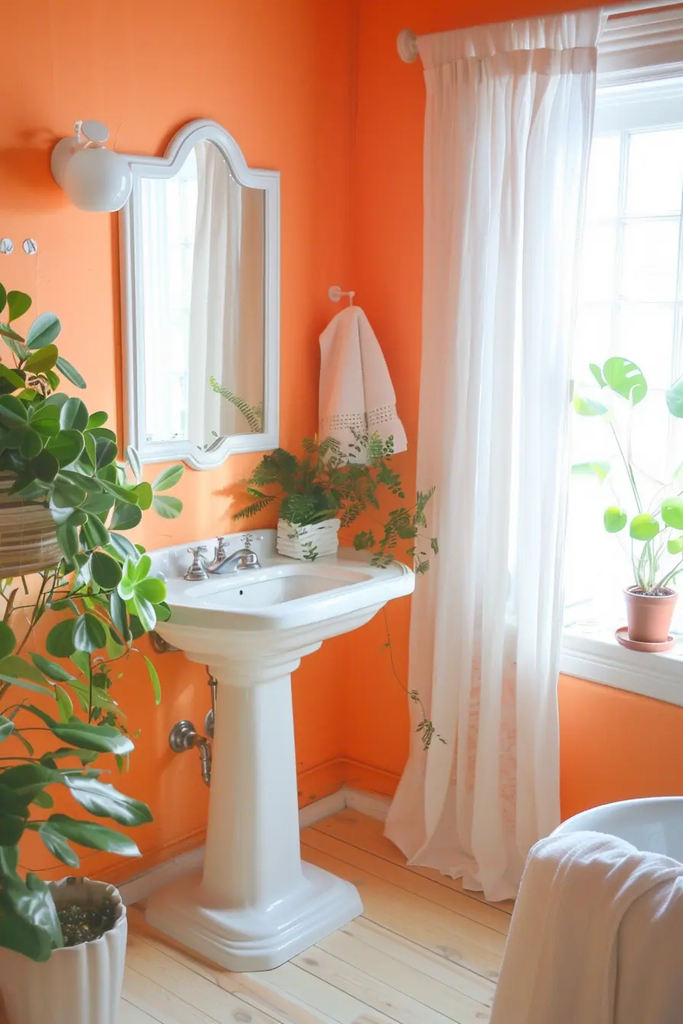
Orange sherbet gives a bathroom a warm, playful personality without the intensity of a deep orange. I like this type of color for bathrooms where I want a cheerful start to the day.
It pairs nicely with white fixtures, light wood, cream textiles, and simple gold or brushed-metal hardware. Because it has a strong personality, I would keep the rest of the room fairly simple.
3. Bright White
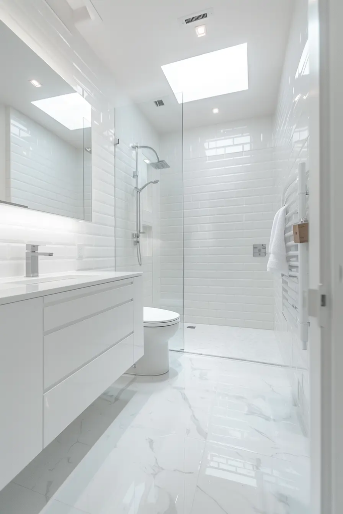
Bright white remains a practical option when I want a bathroom to look clean, fresh, and open. It reflects available light and can make a compact room feel less enclosed.
I also like white because it gives me flexibility with towels, artwork, hardware, and accessories. However, I always check the undertone because some whites lean blue while others look warmer or creamier.
4. Tomato Red
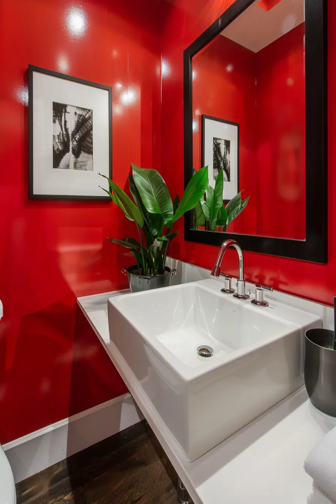
Tomato red is for anyone who wants the bathroom to have real visual energy. I would use it when a quiet neutral palette feels too predictable and I want the walls to become part of the room’s personality.
Because red is visually strong, I prefer balancing it with neutral flooring, simple white fixtures, and restrained accessories. A powder room can be a particularly good place to experiment with a color this bold.
5. Black
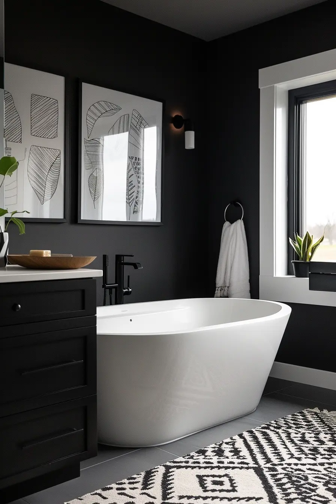
Black paint can give a bathroom a sophisticated, modern appearance while creating strong contrast against lighter fixtures. I especially like the combination of black walls with white sinks, mirrors, and towels.
I would be more cautious with black in a small bathroom that already lacks natural light. Good layered lighting becomes important because dark walls absorb more light than pale surfaces.
6. Yellow
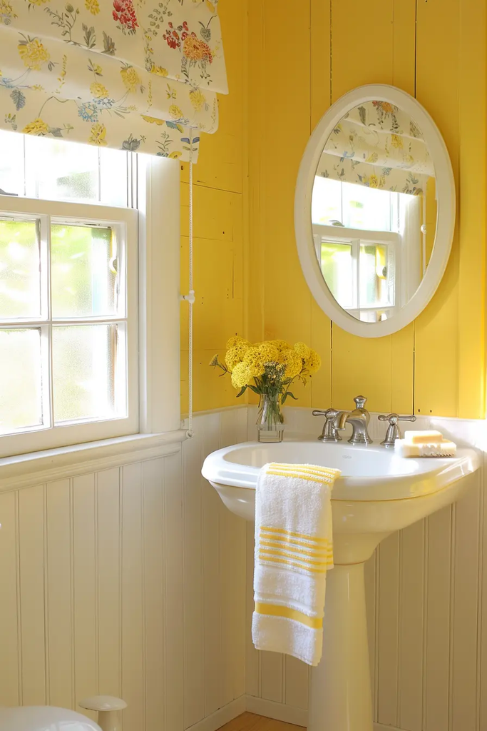
Yellow can instantly make a bathroom feel cheerful and energetic. I like soft or moderately saturated yellow when I want the space to feel welcoming without becoming overwhelming.
White trim and light-colored fixtures help keep the room balanced. If the bathroom receives strong sunlight, I recommend testing the shade because bright daylight can make yellow appear much more intense.
7. Pink
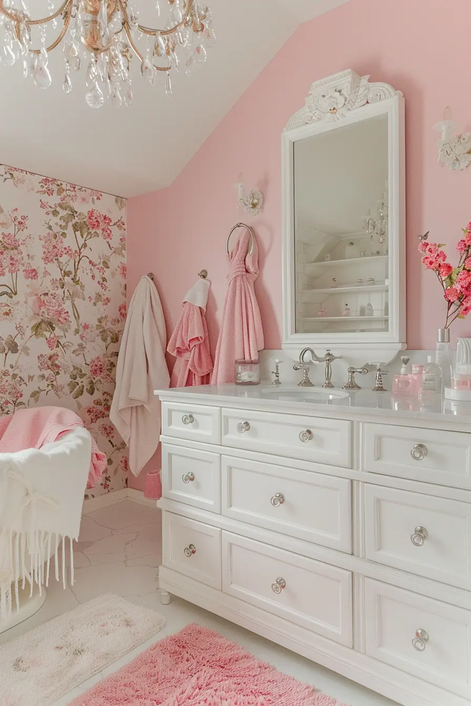
Pink can bring warmth and softness to a bathroom without requiring a traditionally feminine decorating style. I like dusty, muted, or blush-leaning pinks with marble-look surfaces, white tile, or warm metallic fixtures.
A softer pink can also work well when I want the bathroom to feel comfortable and relaxed rather than highly dramatic.
8. Cobalt Blue
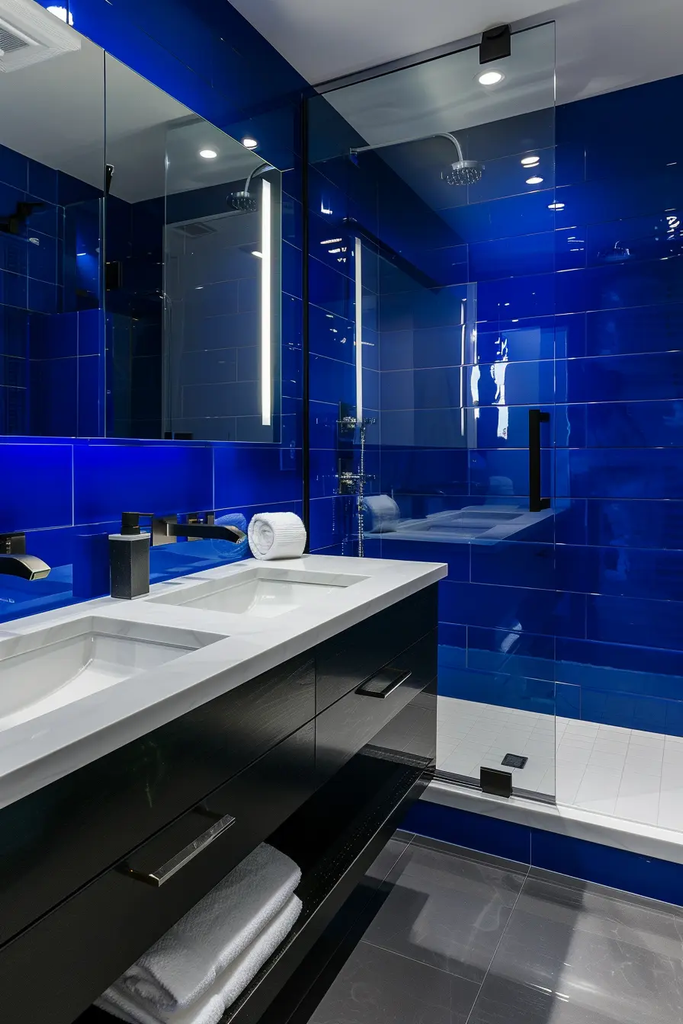
Cobalt blue creates an immediate focal point. I would choose it when I want a bathroom to have a confident, colorful look instead of relying entirely on neutral finishes.
I find that white fixtures and simple flooring help cobalt blue stand out without making the room feel visually cluttered. It can also work well on one feature wall.
9. Cream
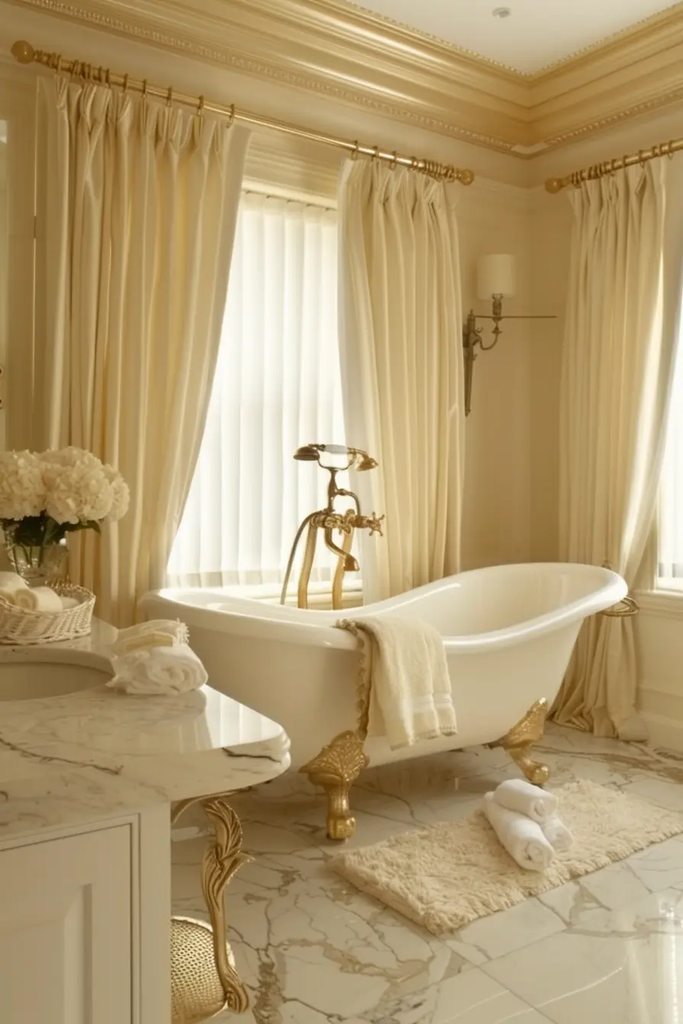
Cream is one of the easiest colors to use when I want warmth without committing to a strong hue. It can make a bathroom feel softer than a bright, cool white.
I especially like cream with natural wood, beige stone, aged brass, and traditional bathroom details. It is also a useful choice when the existing finishes have warm undertones.
10. Eggplant Purple
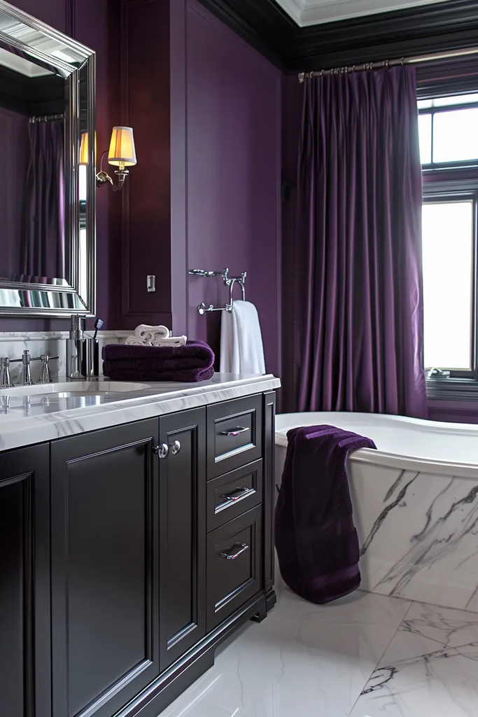
Eggplant purple gives a bathroom a deep, rich character. I would use this color when I want the space to feel more dramatic and sophisticated.
Because the shade is intense, I like pairing it with lighter countertops, mirrors, and fixtures. Adequate lighting is also important so the walls do not make the room feel unnecessarily dark.
11. Bright Green
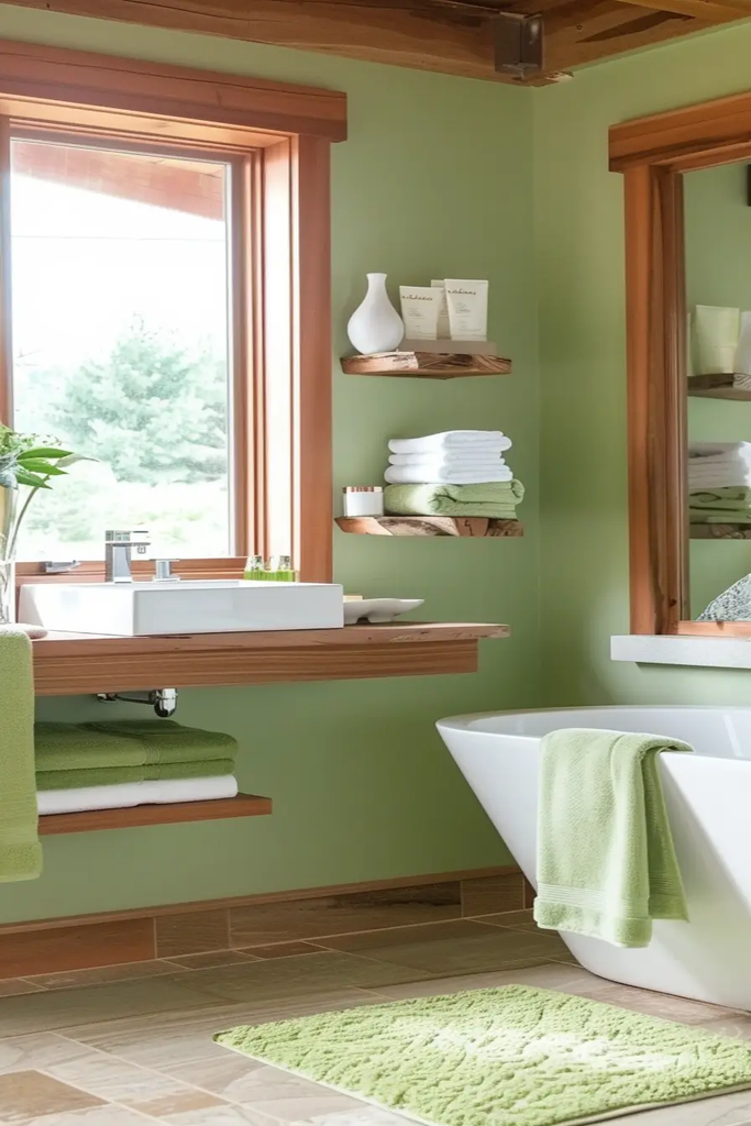
Bright green can make a bathroom feel lively and connected to the outdoors. I like this choice for spaces where I want plenty of personality and a fresh visual impact.
To keep the room balanced, I would combine the walls with white or light neutral finishes. Plants and natural materials can reinforce the fresh, botanical feel.
12. Warm White
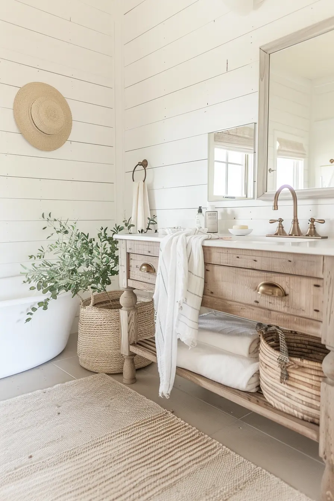
Warm white is a great middle ground when bright white feels too stark. I often prefer it in bathrooms with beige, cream, wood, or warm stone finishes.
The subtle warmth can make the room feel more comfortable while still keeping the overall appearance light. It is also a versatile background for changing seasonal accessories.
13. Barely-There Gray
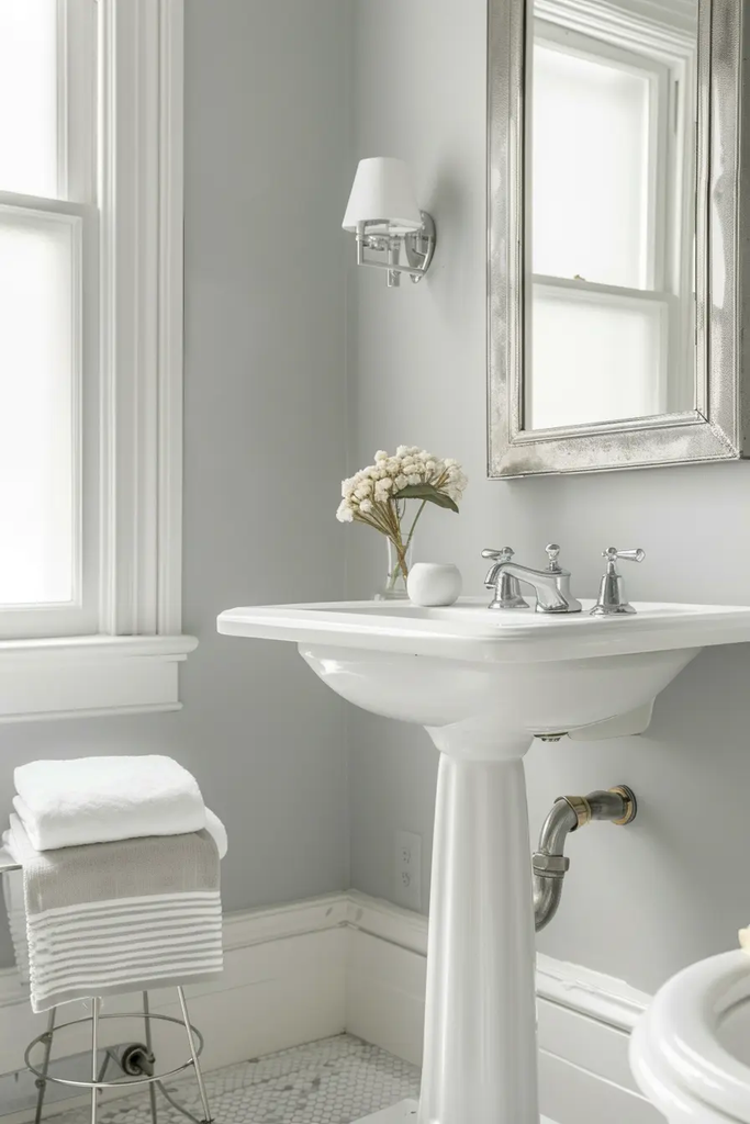
Barely-there gray gives me just enough wall color to create definition without making the bathroom feel heavy. It works particularly well when I want the tile, vanity, mirror, or artwork to remain the main focus.
I would consider this shade for a minimalist bathroom because it adds dimension while keeping the palette restrained.
14. Butter Yellow
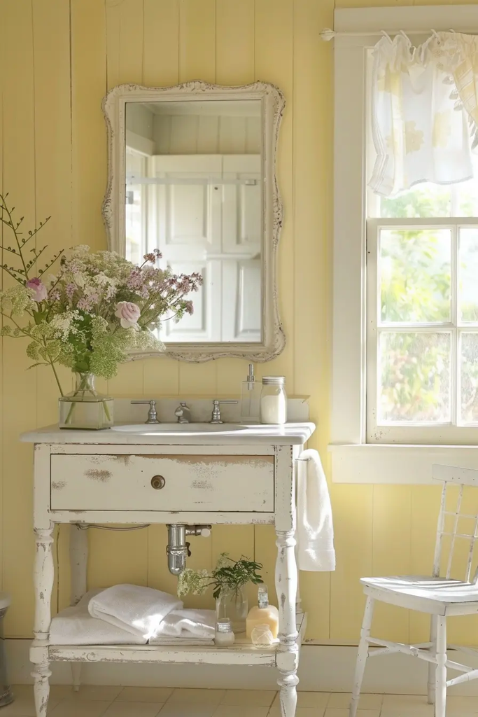
Butter yellow has a softer appearance than many traditional yellow paints. I like it when I want to add warmth and cheer without creating an overly bright bathroom.
It looks especially comfortable with white, cream, light wood, and natural textures. In a bathroom with little natural light, I would still test samples because yellow can shift noticeably under artificial bulbs.
15. Charcoal
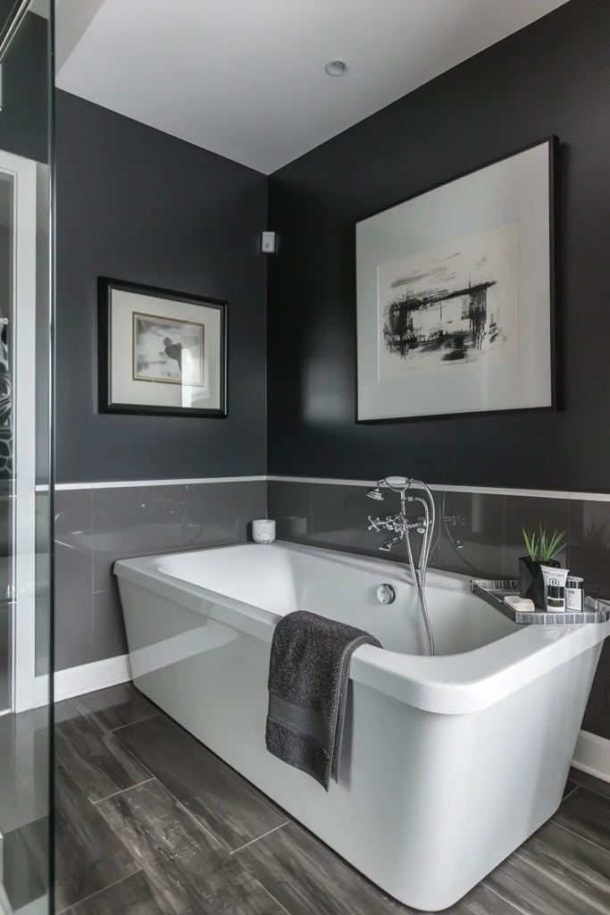
Charcoal gives me the drama of a dark wall without the stark contrast of pure black. It is a strong choice for modern bathrooms with simple lines and contemporary fixtures.
I like pairing charcoal with white, gray, wood, or metallic accents. If the room is small, I would make sure the lighting is strong enough to keep the space comfortable.
Also read: 20 Green Powder Room Ideas Modern Small Bathroom Decor
16. Sand
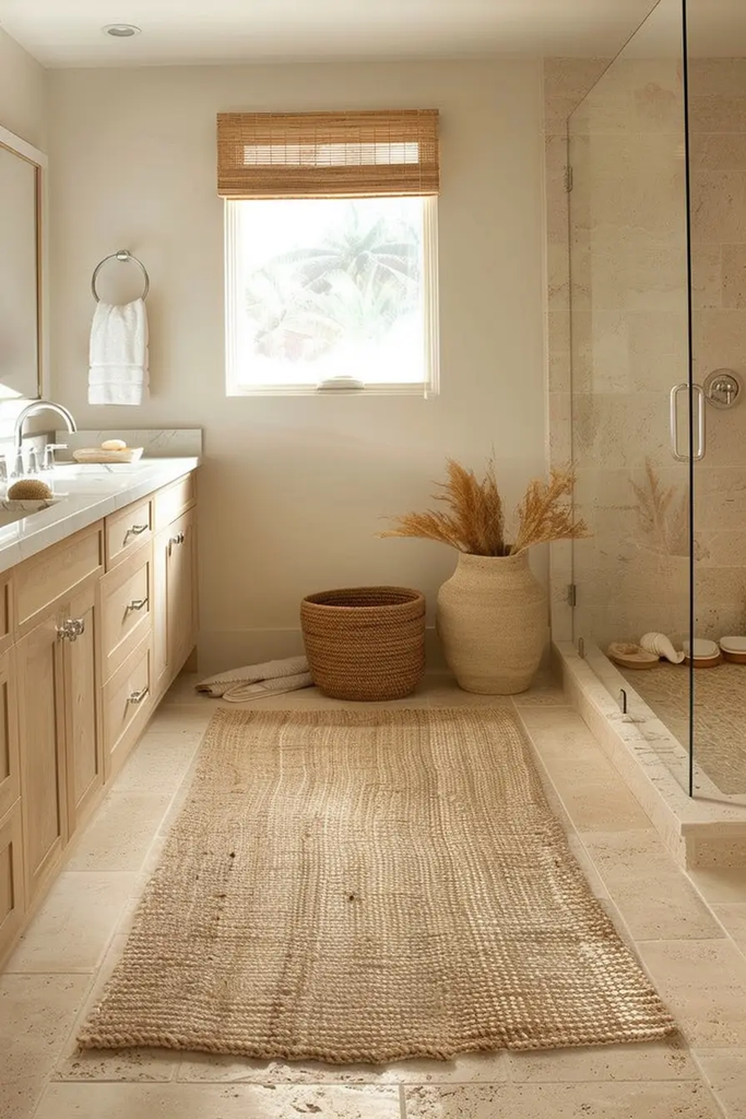
Sand-colored paint brings a subtle earthy quality to the bathroom. I like this shade when I want the room to feel relaxed and natural rather than highly decorated.
It works well with beige tile, wood, woven baskets, stone surfaces, and white fixtures. For coastal or organic-inspired bathrooms, it can create a warm foundation without relying on obvious blue tones.
17. Royal Blue
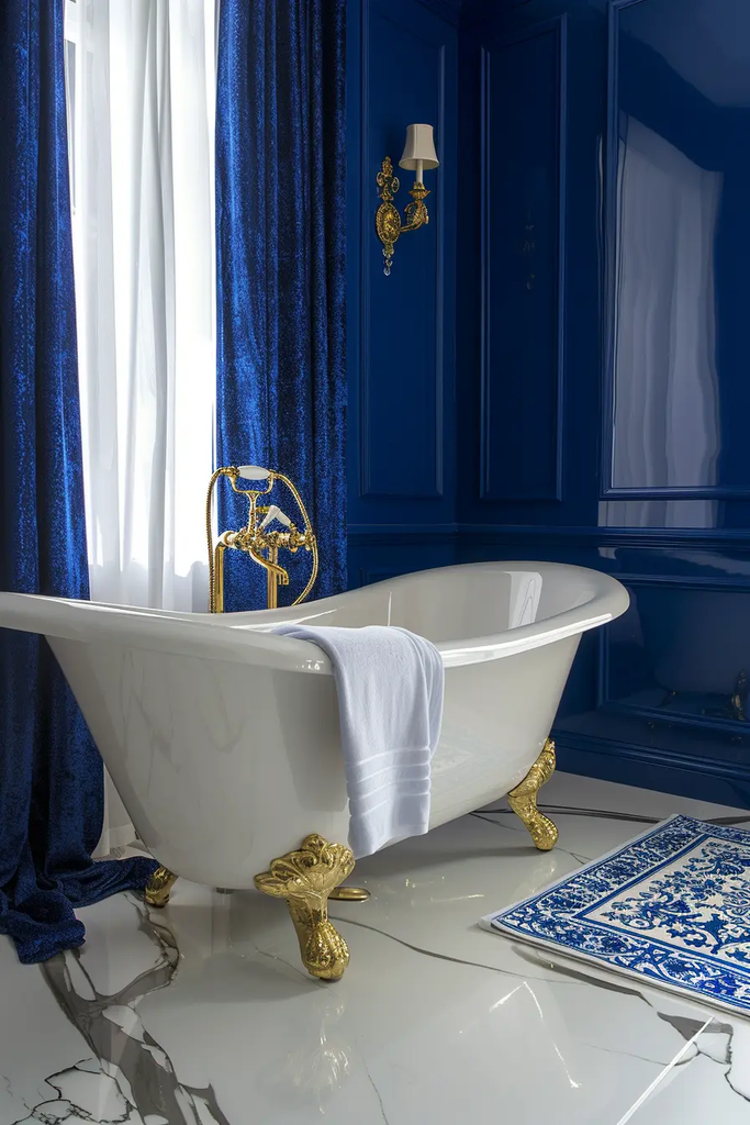
Royal blue gives a bathroom a bold and polished appearance. I would choose it when I want the walls to become a major design feature.
White fixtures provide a crisp contrast, while brass hardware can add warmth. Since royal blue has strong saturation, I prefer keeping competing colors to a minimum.
18. Seafoam Green
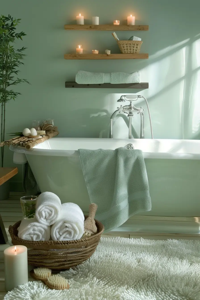
Seafoam green creates the soft, fresh feeling I often want in a bathroom. Its combination of blue and green undertones can work especially well with white tile and light natural materials.
I like using it when the goal is a peaceful, spa-inspired atmosphere without making the room completely neutral.
19. Soft Black
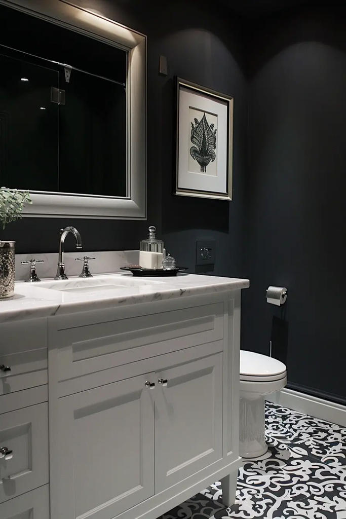
Soft black gives me the depth of a dark paint color with a slightly gentler appearance than a very stark black. It can create an elegant backdrop for mirrors, artwork, and lighter bathroom fixtures.
I would use this shade thoughtfully in smaller spaces and make sure the room has enough ceiling, vanity, and mirror lighting.
20. Cotton Candy Pink
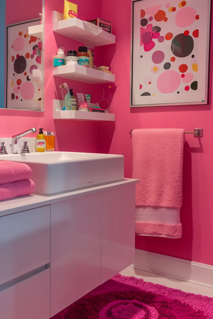
Cotton candy pink brings a playful quality to the bathroom. I would consider it for a bathroom where I want the color scheme to feel youthful, cheerful, and different from standard neutral palettes.
White, pale wood, and simple accessories can prevent the room from feeling too busy. A softer pink also works nicely if I want color without an extremely bold finish.
21. Blue-Gray
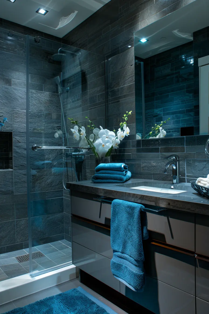
Blue-gray is one of the colors I would consider when I want something more interesting than plain gray but calmer than a saturated blue.
It can create a cool, peaceful backdrop for white tile, chrome fixtures, and natural wood. I also like it in bathrooms where I want a subtle connection to water without using an obvious coastal theme.
22. Grape Purple
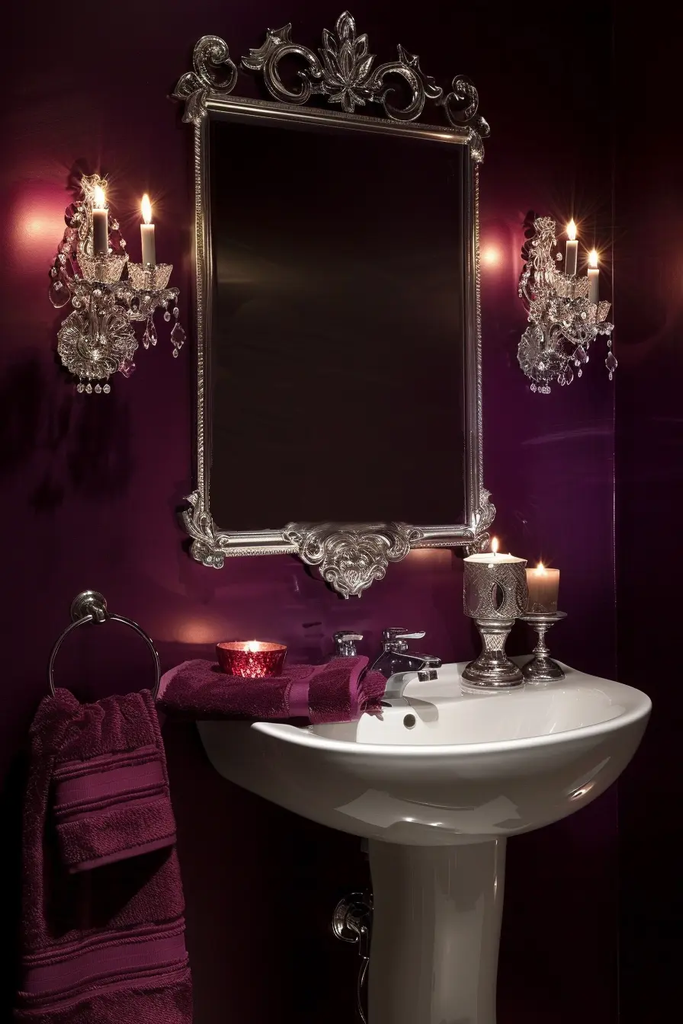
Grape purple adds strong color and depth to a bathroom. I would use it when I want a more dramatic look and have enough lighting to support a deeper wall color.
The easiest way for me to balance this shade is with simple white fixtures and restrained accessories. In a powder room, it can make a small space feel intentionally decorated.
23. Off-White
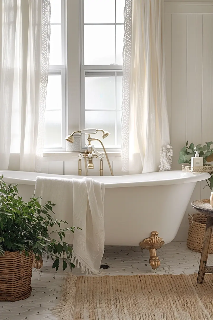
Off-white is a reliable choice when I want the bathroom to feel bright but not overly stark. Unlike some very cool whites, warmer off-whites can give the walls a softer appearance.
I find this shade particularly useful when the bathroom already contains several materials or patterns because it creates a quiet background without competing for attention.
24. Blue-Green
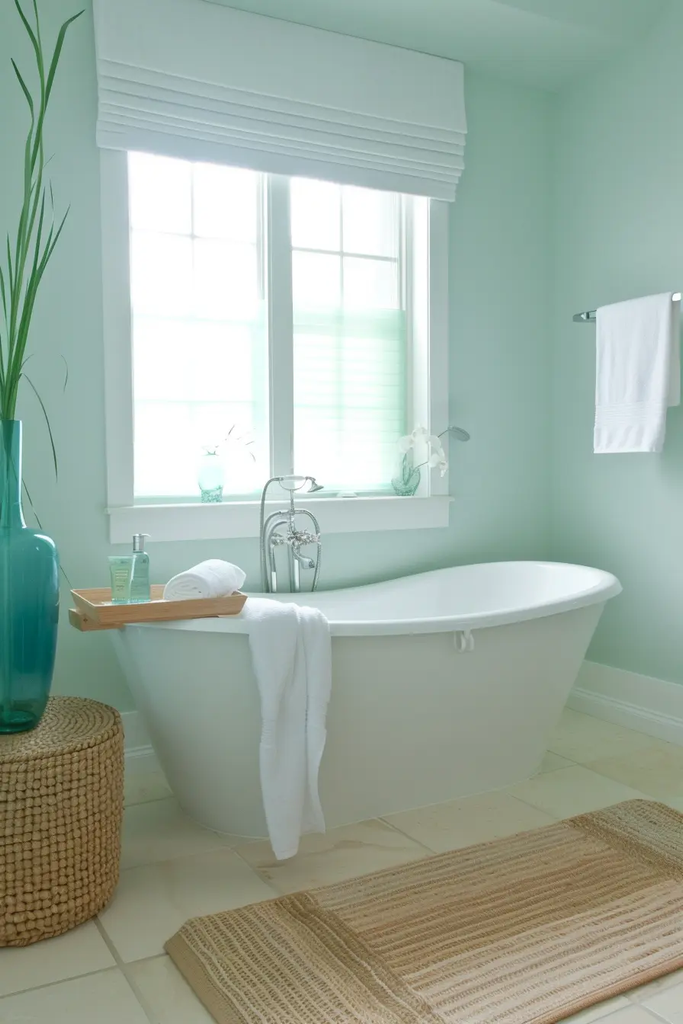
Blue-green gives me the calming qualities of blue while adding some of the natural freshness associated with green. It can work beautifully in bathrooms with white, cream, wood, or stone finishes.
I would test several samples because blue-green paints can shift considerably depending on the amount and direction of natural light.
25. Light Gray
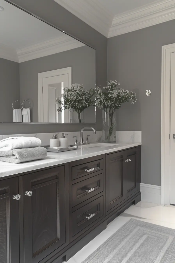
Light gray is a practical option when I want a clean, contemporary bathroom without using white on every surface. It adds subtle contrast while remaining easy to coordinate with different fixtures.
I especially like it with white tile, black hardware, pale wood, and minimalist accessories. It can also provide a useful backdrop if I plan to change the bathroom decor later.
Read this next: 23 Neutral Bathroom Ideas to Revamp Your Space
26. Blush
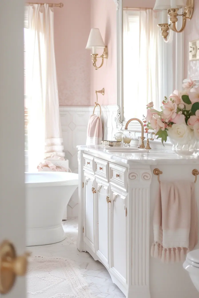
Blush creates a gentle warmth that can make a bathroom feel inviting and comfortable. I like this shade with cream, white, brass, marble, and natural wood.
It is subtle enough for everyday use while still giving the walls more character than a basic neutral. I would choose a muted blush if I want the room to feel timeless rather than overly trendy.
27. Cornflower Blue
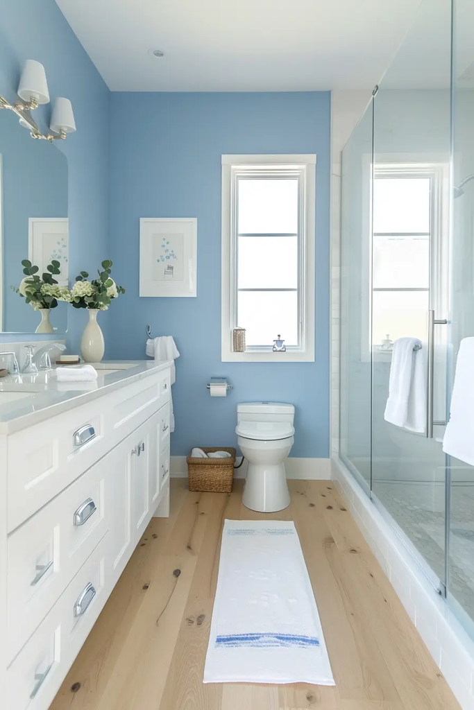
Cornflower blue brings a light, cheerful quality to the bathroom. I like it when I want color that still feels airy and approachable.
It pairs naturally with white fixtures and light neutral flooring. For bathrooms with plenty of daylight, this shade can help reinforce a bright and refreshing atmosphere.
FAQ’s
What is the best paint color for a small bathroom?
Light shades such as warm white, cream, light gray, and soft blue can help a small bathroom feel brighter and more open.
What bathroom colors create a relaxing atmosphere?
Sage green, seafoam green, blue-gray, and soft blue are great choices when I want my bathroom to feel calm and spa-like.
Should I use dark paint in a bathroom?
Yes. Charcoal, black, and deep blue can look stylish in a bathroom, especially when paired with good lighting and lighter fixtures.
Conclusion
Choosing bathroom paint becomes much easier once I look at the entire room rather than the paint chip alone. I consider natural light, bathroom size, tile undertones, flooring, fixtures, and the mood I want before making my final choice.
For a bright and open appearance, I would start with white, warm white, off-white, cream, or light gray. If I want more color, sage, seafoam, blue-gray, blush, or blue-green can add personality while remaining relatively easy to live with.
For a dramatic bathroom, darker choices such as charcoal, black, soft black, eggplant, or deep blue can make a strong statement. My biggest recommendation is to sample the paint directly on the wall and observe it during both daytime and evening lighting before buying enough for the entire room.

One Comment