21 Easy Flower Painting Ideas
I’ve always found flower painting easier when I stop worrying about making every petal look botanically perfect. Most flowers can be broken down into simple shapes, dots, curves, short strokes, and stems, which gives me a much easier starting point.
These ideas are suitable for beginners as well as anyone who wants a relaxed painting project. I can work on one flower at a time, practice the brushwork on scrap paper, and change the colors or size without needing to copy the example exactly.
The same techniques can work on suitable watercolor paper, heavier paper, canvas, cards, wrapping paper, journals, or other surfaces that match the paint I’m using. I just make sure the surface can handle the medium before I begin.
This collection includes 21 easy flower painting ideas, ranging from simple poppies and tulips to more layered flowers such as roses, hydrangeas, and irises.
I break the flowers into basic shapes and brush movements rather than trying to paint every botanical detail. Some ideas need only a few strokes, while others give me practice with layering, color mixing, spacing, and composition.
Save this for later
Table of Contents
I can use acrylic, watercolor, or gouache as long as I choose a suitable surface for the medium. These flower painting techniques can be adapted for cards, wall art, wrapping paper, journal pages, and handmade gifts.
Key Takeaways
- I start with simple petals, dots, curves, and stems before adding small details.
- I test unfamiliar brushstrokes and color combinations on scrap paper first.
- Related shades of one color can add depth without making the painting complicated.
- I choose a brush size based on the detail I need rather than using one brush for everything.
- I let layers dry when I need cleaner edges or want to add details over an existing color.
- Negative space can make a floral painting feel less crowded.
- I can change the scale, colors, and spacing to make one technique work for several projects.
- The surface should match the paint, especially when I’m working with water-based media.
Related article: 31 Crafts for 5 Year Olds
What You’ll Need
I don’t need an expensive collection of art supplies for these flower painting ideas. I can work with a small set of basic materials and add specialty tools only if a particular technique calls for them.
- Acrylic, watercolor, or gouache paint
- Watercolor paper, heavier paper, or suitable canvas depending on the medium
- A few small and medium paintbrushes
- A palette or clean mixing surface
- Water container
- Paper towel or an old clean cloth
- Pencil for very light planning if needed
- Scrap paper for testing brush pressure and paint load
- Optional fine-tip marker for details after the paint has completely dried
Choosing the Paint and Surface
Watercolor generally works best on watercolor paper or another surface designed to handle water. I use lighter layers and control how much water is on my brush because excess moisture can make the paint spread farther than I intended.
Acrylic is useful when I want more opaque layers and fairly quick drying between steps. I use it on suitable canvas or heavier paper rather than thin printer paper.
Gouache gives me a more opaque finish and works nicely for bold, simplified flower shapes. Like acrylic and watercolor, I choose a surface that is appropriate for the amount of moisture and paint I plan to use.
I don’t consider one medium universally better than another. The choice mostly comes down to the look I want and the materials I already have.
1. Common Poppy
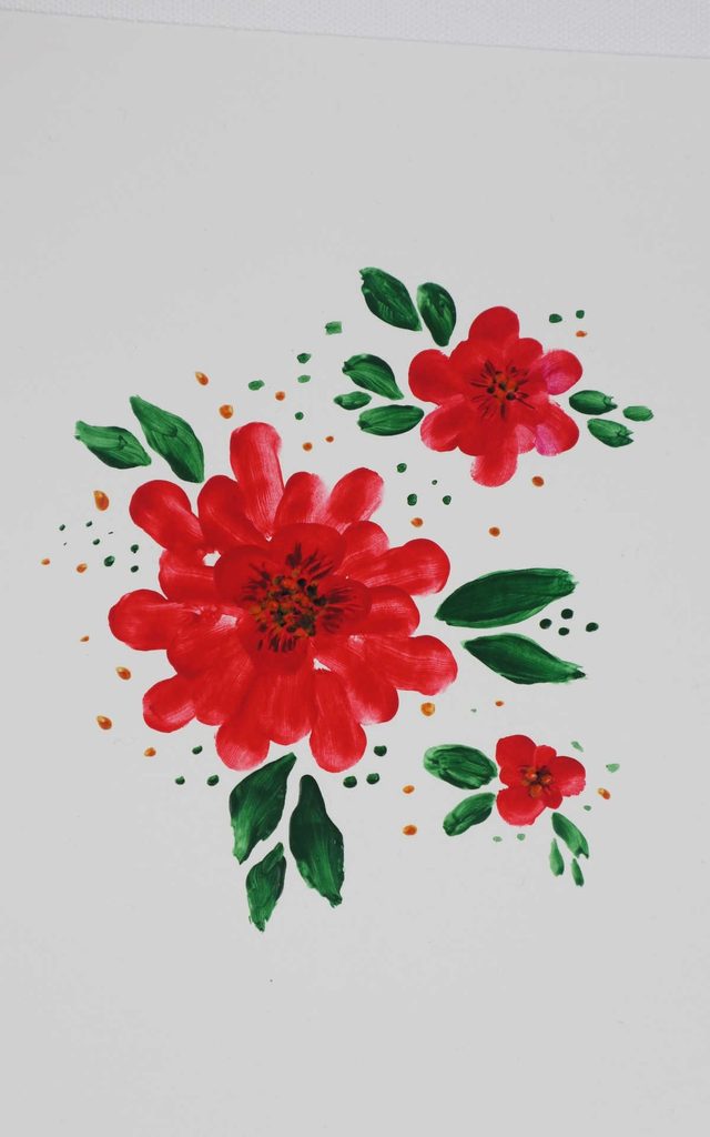
Poppies are one of my favorite starting points because their petals can be loose and expressive. I don’t need to make every petal the same size to make the flower recognizable.
For this one, I begin with the center and work outward using rounded, sweeping strokes. I keep the brush movement fairly light so the petals don’t become heavy blocks of paint.
Red is an easy choice, but I can switch to orange, pink, coral, or another color. Changing the color is one of the simplest ways to make the same flower technique feel completely different.
Pro Tip: I leave small areas between some of the petals instead of filling everything in. That bit of negative space helps the flower look lighter.
2. Cherry Blossom
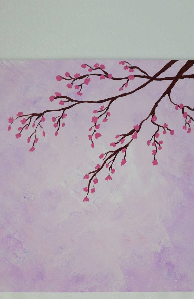
Cherry blossoms give me a chance to practice smaller marks and thin branches. Their delicate appearance comes more from the arrangement of the small flowers than from complicated painting techniques.
My starting point is the branch. I use a small brush for the thinner lines and then add small groups of petals along it.
I avoid placing every blossom at the same angle or distance. A few unopened buds mixed with larger flowers make the branch feel less repetitive.
This is one painting where I prefer to work slowly. If I need to add darker centers or another layer, I wait until the first marks are dry enough that they won’t smear together.
Pro Tip: I practice the smallest flower marks on scrap paper first. It helps me get a feel for how much paint is actually on my brush.
3. Red Flowers About to Blossom
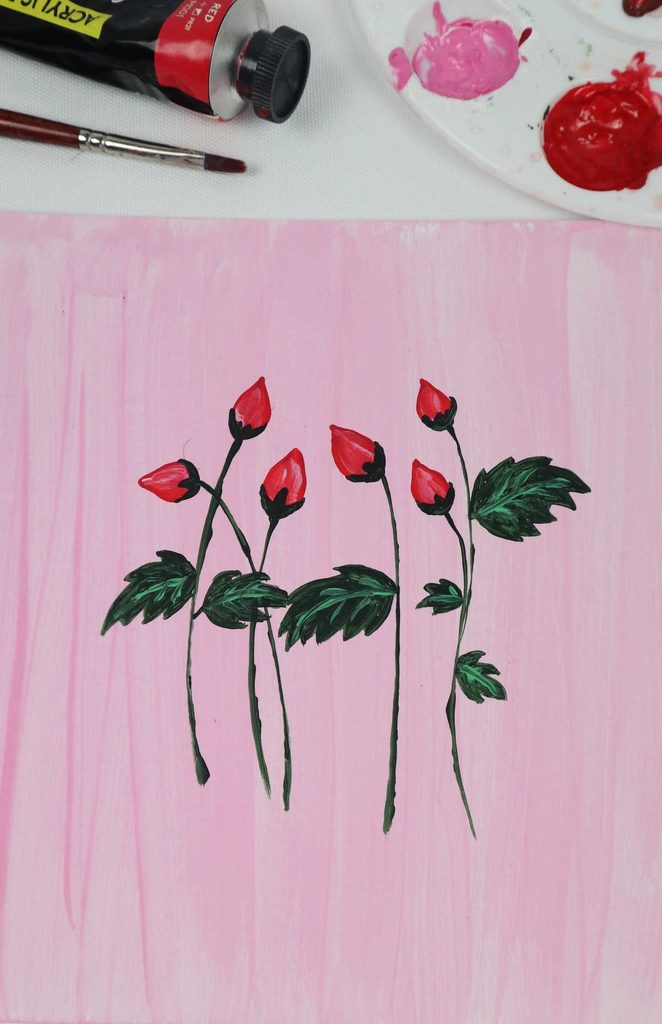
Flower buds give me a different shape from fully opened blooms, and I like using them to create variety in a floral painting.
I begin with a narrow bud shape and build the color around it, keeping the top tighter than the lower section. I then vary the height and size of the buds instead of lining them up evenly.
Red gives this idea a strong look, but pink, peach, yellow, or purple can work too. I can even combine several related shades in one arrangement.
Pro Tip: I make some buds noticeably smaller than the others. The difference in scale gives the composition more movement.
4. A Field of Flowers

When I paint a field of flowers, I’m paying just as much attention to placement as I am to the individual flowers. If everything sits on the same line, the scene can look flat.
I begin with a few larger flowers and then work smaller ones around them. I vary their height, size, color, and spacing as I move across the page.
I don’t try to paint every flower in detail. A mixture of simple blooms, dots, short strokes, and stems can suggest a whole field without making the painting feel overworked.
Pro Tip: I choose two or three main flower colors before I begin. Repeating those colors helps the different flowers look like part of the same scene.
5. Lavender
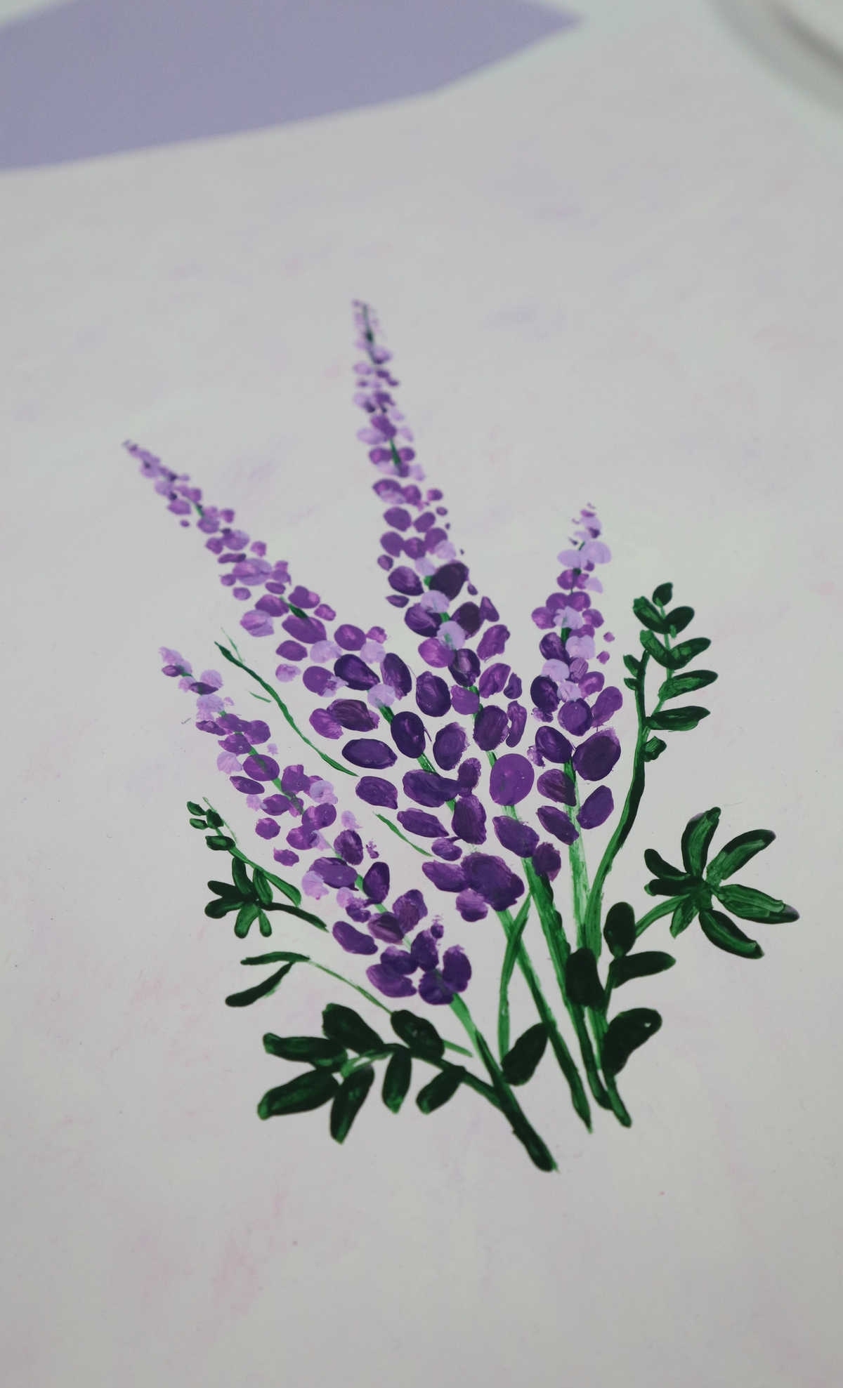
Lavender is especially useful when I want to add vertical height to a floral composition. The narrow stems and clustered flowers can fill an empty area without taking over the whole page.
For this one, I prepare several purple shades before painting. I use the larger shapes first and then add smaller marks along the stems.
Using a darker purple underneath and lighter shades on top can give the flower more depth. I don’t need to blend every mark together.
The leaves can stay simple too. A few narrow green strokes are enough to support the purple flowers.
Pro Tip: I let the first layer dry before adding lighter purple details. This keeps the small marks more distinct.
6. Blue Poppies
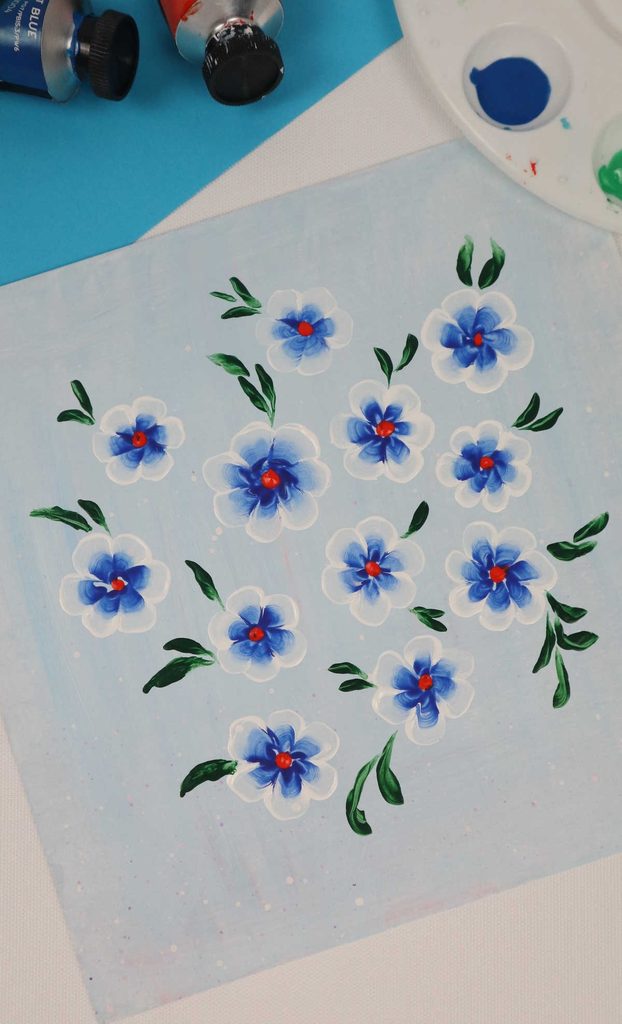
Blue poppies are a fun way for me to practice double-loading a brush. Instead of mixing the two colors completely on the palette, I load the brush with white and then pick up blue with part of the same brush.
I take that loaded brush to the paper and use a dab or small curved movement to create a petal. I repeat the movement several times around the center.
Before working on the final piece, I test the technique on scrap paper. The amount of paint and pressure on the brush can change the shape quite a bit.
Once I’m comfortable with the movement, I can make one large flower or repeat the same technique for a group of smaller blooms.
Pro Tip: I don’t reload the brush after every single stroke unless it needs more paint. The slight color variation can make the petals look more natural.
7. Anemones
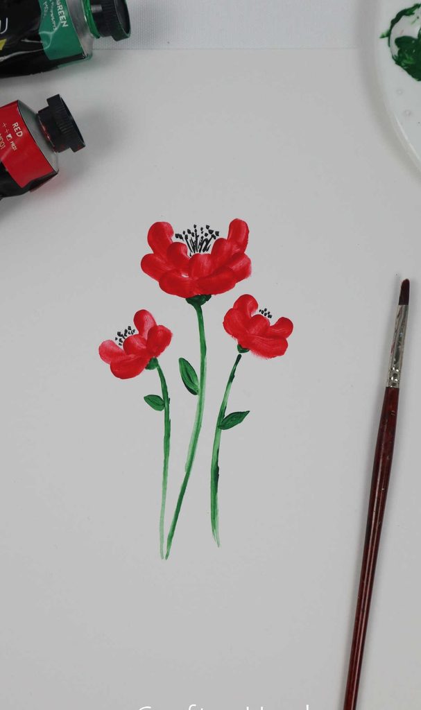
For this anemone, I focus on the petal shape and the way the petals spread from the center. I don’t need complicated shading to create an interesting flower.
I use separate outward strokes for the petals and vary their angles slightly. Making every petal perfectly identical can actually make the flower feel stiff.
I’ve also found that changing the stem length changes the character of the painting. Longer, slightly curved stems give the flowers a looser appearance.
The color can be changed freely. White, pink, purple, blue, and deeper shades can all create different moods.
8. Red Salvias

I use salvia-inspired flowers when I want to create a taller floral pattern. The stems give me a natural way to move the viewer’s eye upward.
I begin with the stems and then add small groups of flowers along them. Instead of putting every stem at the same angle, I turn some slightly to the left or right.
This design can also work as a repeated pattern for a card or decorative paper. I can keep the same basic flower shape while changing the bloom colors.
Pro Tip: I leave some space between the stems. If the flowers are packed too closely together, the individual shapes become harder to see.
9. Orange Kings
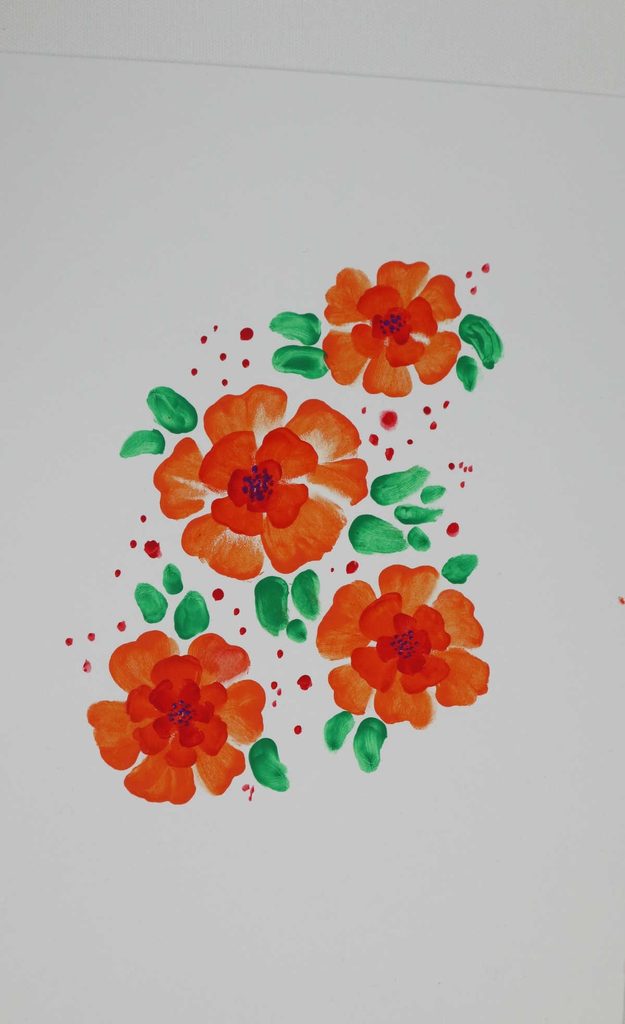
I enjoy working with less structured flower shapes because I don’t feel the need to make every petal exact. This orange flower gives me plenty of room to let the brush marks show.
I begin with a simple central area and build the petals outward using loose strokes. I use more than one orange shade so the flower doesn’t look like it was painted with one flat color.
A slightly darker center can give the flower some definition without requiring detailed line work.
For this idea, I actually think small imperfections help. I let the brush create some of the personality instead of correcting every uneven edge.
10. Blue Hydrangea
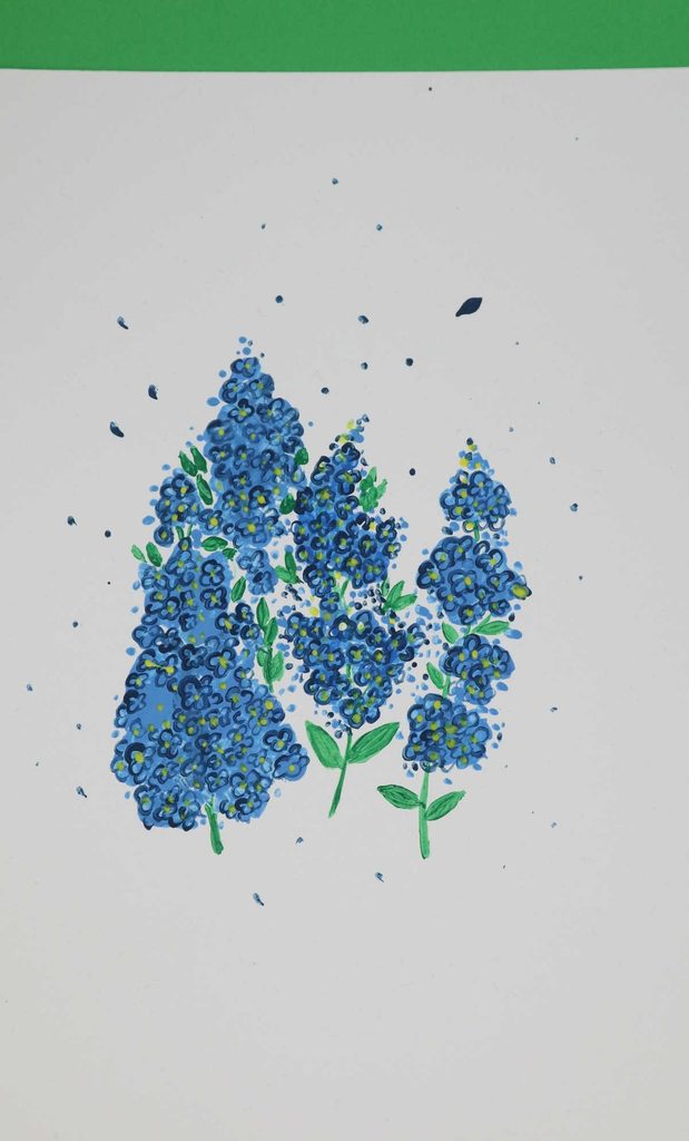
Hydrangeas can look complicated at first because they contain many small flowers, but I approach the whole cluster as a collection of small marks.
I begin with a loose rounded shape and fill it with smaller blue strokes. I then add lighter and darker shades rather than trying to outline every tiny flower.
Layering works especially well here. I let the first color dry before adding more marks so the cluster doesn’t turn into one muddy area.
Once everything is dry, I can use a fine-tip marker for a few accents if I want stronger definition. I only use the marker after the paint has fully dried.
Pro Tip: I don’t make every small flower the same shade. A little variation between the marks makes the cluster feel fuller.
11. Clematis
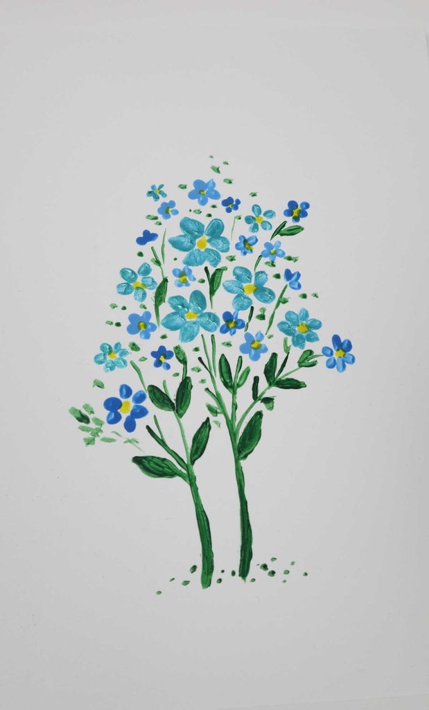
Clematis is useful when I want to practice arranging several larger flowers across a page. The individual petal shape is simple enough to work on without getting caught up in tiny details.
I place my largest flower first, usually near the main visual area of the page. Then I add smaller blooms around it, changing their angles and leaving some open background between them.
That negative space is important. Without it, the flowers can start to blend into one large mass.
For a beginner, I would practice one flower by itself before trying to fill an entire page.
12. Rose
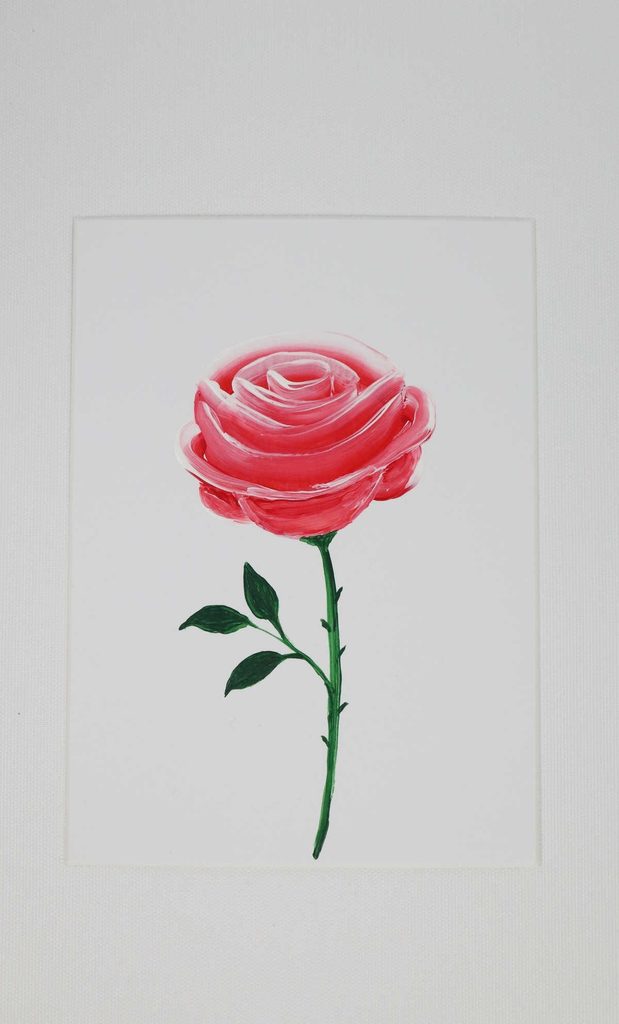
Roses can seem difficult because there are so many overlapping petals, but I simplify them into curved strokes rather than trying to draw every fold.
My starting point is the overall rounded flower shape. From there, I work inward and use smaller curved strokes toward the center.
I like having two or three related shades ready before I start. A lighter base can be followed by darker strokes in selected areas to create depth.
The same method works with pink, red, peach, cream, or other colors. I don’t need to blend every shade completely for the rose to look dimensional.
Pro Tip: I let the base layer dry before adding the smallest center details. It gives me much more control over those narrow strokes.
Also read: 27 DIY Summer Wreath Ideas
13. Iris

Iris flowers have pointed petals, so I use directional brushstrokes to follow their shape. Thinking about the direction of the petal helps me avoid making the flower look like a collection of unrelated marks.
I don’t need to mix every color before I begin. Instead, I keep the main petal colors nearby and add small variations as I work.
For the leaves, I start with a lighter green or yellow-green base. A darker, narrower stroke on top can suggest depth without requiring detailed leaf painting.
A smaller brush is useful for the inner flower details, especially where several colors meet.
14. California Poppies
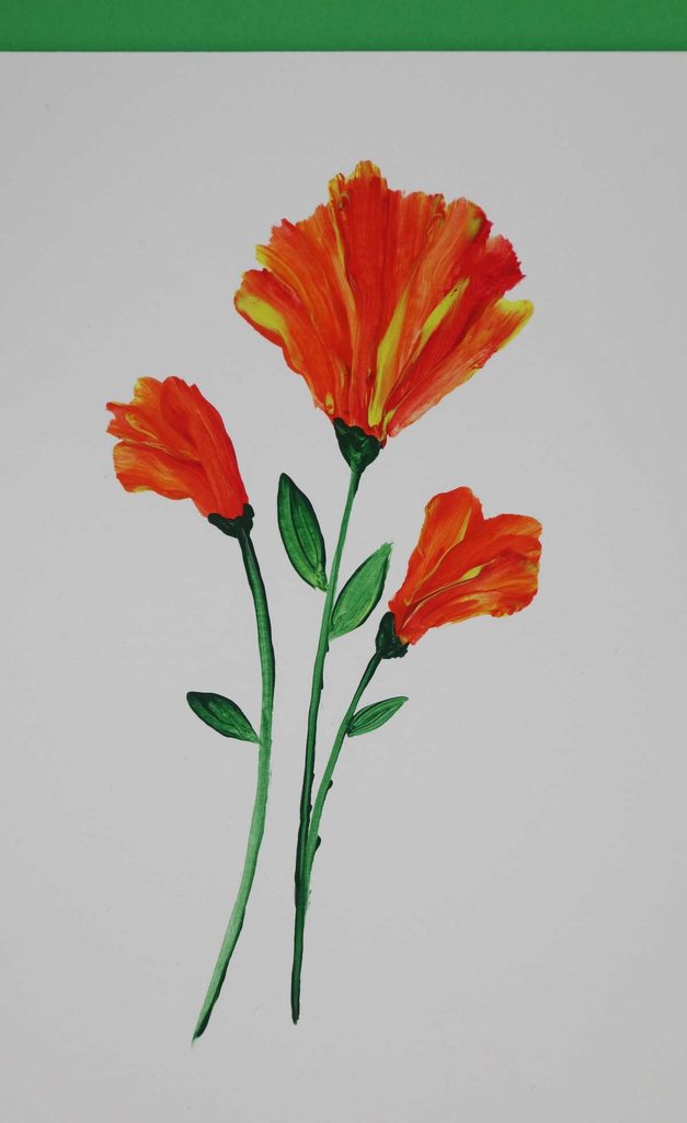
California poppies are a good choice when I want warm, bright colors. I put yellows, oranges, and reds on my palette without completely mixing them into one shade.
For the petals, I use upward brushstrokes and allow some of the colors to remain visible. This creates variation without requiring detailed shading.
The amount of pressure I use changes the width of the stroke. I practice that pressure on scrap paper first if I’m trying to make several flowers look similar.
I can paint a single bloom or repeat several at different heights for a small field.
Pro Tip: I avoid overmixing the warm colors. Keeping some yellow, orange, and red separate gives the petals more visual variety.
15. Butterfly Weed
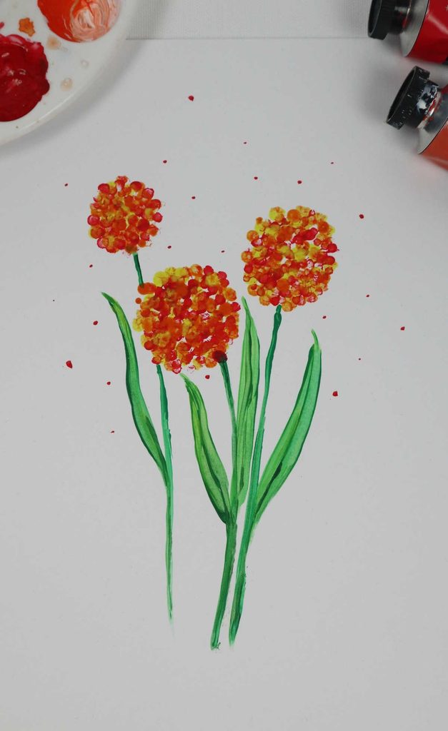
Butterfly weed works well when I want to practice groups of smaller flowers. Rather than treating each bloom as a separate focal point, I use several clusters to create one larger arrangement.
I begin with the stems and then add small flower shapes around them. Varying the flower size and color keeps the clusters from looking like identical stamps.
I can also bend a few stems slightly to suggest movement. That small change can make the scene feel more natural without requiring extra detail.
This flower works nicely as part of a garden scene, especially when I want to add smaller flowers around a larger focal bloom.
16. Pink Flowers About to Blossom
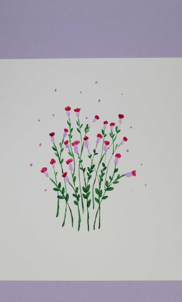
I enjoy using flower buds alongside open flowers because they give me different shapes to arrange. Here, I focus more on the buds themselves rather than making them look like fully opened blooms.
I begin with the middle and work outward, keeping some flowers larger and others smaller. I like starting with one oversized bloom and gradually reducing the size as I move outward.
Soft pinks and pastels work naturally for this idea, but I can change the palette completely if the painting calls for it.
The buds can stand alone, form a small bundle, or become part of a larger floral scene.
Pro Tip: I don’t make every bud face the same direction. Slight changes in angle keep the arrangement from looking too repetitive.
17. The Field of Flowers
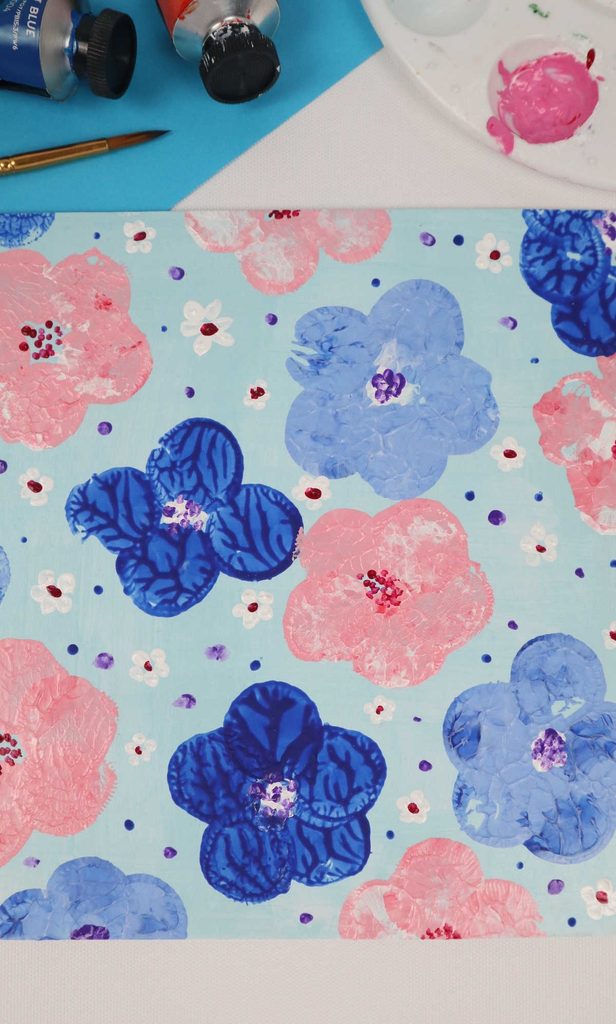
This flower field is different from the earlier hand-painted field because I use a stamping technique to create repeated flowers.
A cork or cylindrical sponge can work for this method. I put a manageable amount of paint onto the stamping surface and test it before placing it on the final paper.
The amount of paint matters. Too much can create a heavy, blurry shape, while too little may leave an incomplete print.
I vary the spacing and colors instead of stamping a perfectly even grid. This makes the finished pattern more relaxed.
This technique can be particularly useful for cards, wrapping paper, or a simple painting activity with children.
Pro Tip: I keep scrap paper underneath my test marks. It lets me adjust the paint load before I start working on the final surface.
18. Sunflower
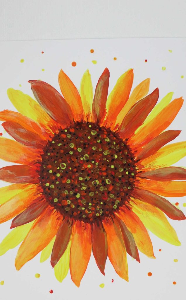
Sunflowers have a strong central shape, so I establish the middle before worrying about the petals.
I prepare the yellow shades I want first and keep a darker brown or earthy color nearby for the center. After the first layer of petals is in place, I can add another few strokes to make the flower look fuller.
I don’t try to make every petal exactly the same. Some variation in length and direction keeps the flower from looking mechanically repeated.
For a larger painting, I can use one sunflower as the focal point and surround it with smaller flowers or leaves.
Pro Tip: I step back from the painting occasionally instead of checking it only up close. This helps me notice whether the flower is balanced within the whole composition.
19. Cute Mandevilla
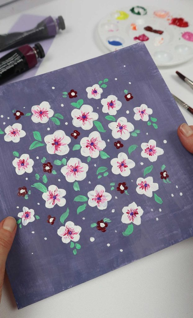
Mandevilla flowers are useful when I want to create a page filled with repeated blooms. Their simple flower shape allows me to work across a larger area without adding complicated details to every flower.
I begin with several larger flowers and then fill some of the open spaces with smaller ones. Layering flowers at different sizes helps keep the page from feeling too uniform.
I can use one main color family or introduce a few related shades. The important part is keeping enough negative space so the flowers remain easy to distinguish.
This idea can work well for a journal page, decorative artwork, or handmade card when I want a repeated floral pattern.
Pro Tip: I step away from the painting every few minutes to check the overall spacing. It is much easier to spot a crowded area from a little distance.
20. Tulips

Tulips are one of the simpler flowers for me to reduce to a few clean shapes. I prefer keeping the arrangement minimal rather than filling the page with dozens of blooms.
For each tulip, I begin near the bottom and use curved strokes to create the cup-like flower shape. I can then add a small amount of detail where the petals overlap.
Using one main color for the petals keeps the painting simple. Pink, yellow, red, purple, or even an unexpected color can work.
I also leave plenty of space between the flowers. That negative space gives each tulip room to stand out.
Pro Tip: I paint two or three tulips together before adding more. It makes it easier to judge whether the spacing and scale are working.
21. Anemone
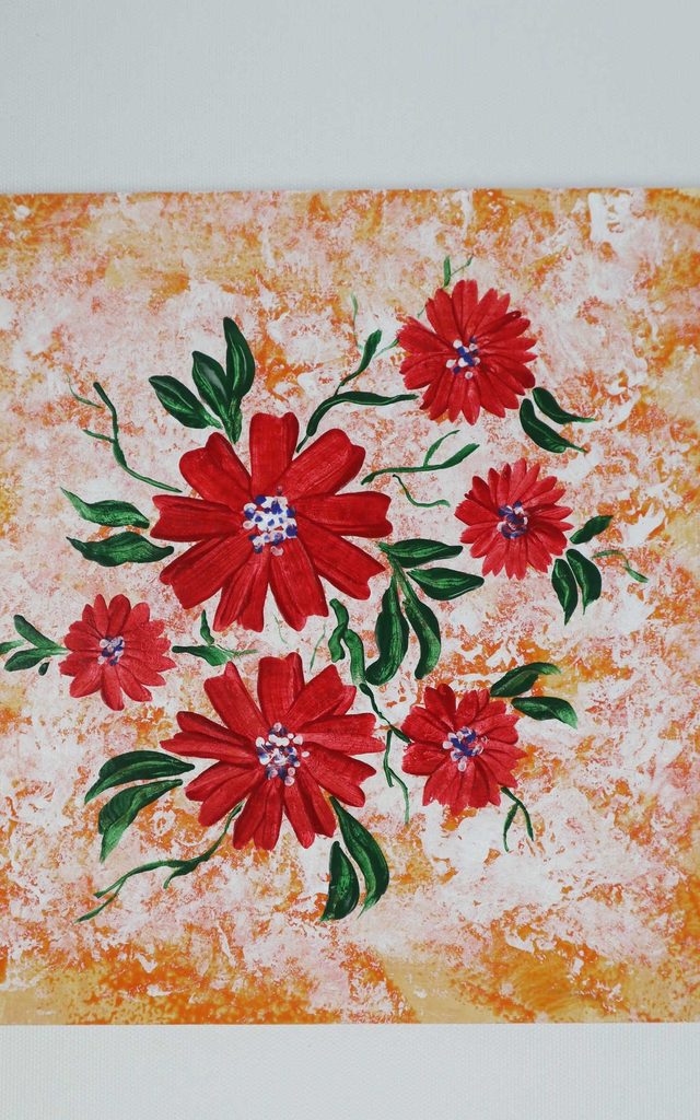
For this second anemone idea, I use a front-facing composition rather than the looser flower-and-stem approach earlier in the article. That makes this version especially suitable for a greeting card or small piece of artwork.
I paint the petals as individual outward strokes from the center. I can add as many petals as the flower shape needs, but I don’t try to make them perfectly identical.
Once the first layer has dried, I return to the center and add the darker details. This second layer helps separate the middle from the lighter petals.
The flower can be large and simple or repeated several times across a card or journal page.
Pro Tip: I keep the center darker than the petals but use only enough paint to create contrast. Too much detail in the middle can compete with the flower’s simple shape.
Frequently Asked Questions
What is the easiest flower to paint for beginners?
Poppies, tulips, lavender, and simple flower fields are good places to start because I can create them with basic strokes and shapes. I would practice one flower at a time before combining several into a larger painting.
What paint is best for flower painting?
I can use watercolor, acrylic, or gouache for flower painting. My choice depends on the finish I want and the surface available. Watercolor works well on suitable watercolor paper, while acrylic and gouache can be used on appropriate heavier paper or canvas.
How do I make flower paintings look more detailed?
I add detail gradually rather than trying to paint everything at once. Using related shades, smaller brushes, layered petals, darker centers, and varied brush pressure can add depth without making the flower overly complicated.
Can I use these flower painting ideas on greeting cards and other crafts?
Yes. I can scale the flowers up or down and adapt the colors for greeting cards, wrapping paper, journals, wall art, and handmade gifts. I make sure the paint and surface are compatible before starting.
Read this next: 17 Pipe Cleaner Crafts for Kids That Are Fun to Twist Together
Conclusion
Flower painting doesn’t have to begin with realistic botanical artwork. When I break a flower into petals, dots, curves, stems, and simple shapes, I have a much more manageable place to start.
For a first project, I would begin with poppies, lavender, tulips, or the simple flower fields. Once I’m comfortable with those brush movements, I can practice roses, hydrangeas, and irises that involve more layering and detail.
I also like changing the scale and color instead of trying to reproduce one exact example. The same flower technique can become a small greeting card, wall art, wrapping paper, journal decoration, or handmade gift.
The most useful part of practicing these easy flower painting ideas is learning one technique at a time. A few minutes spent testing brush pressure, paint load, spacing, and color on scrap paper can make the actual painting much easier.
For cleanup, I rinse brushes promptly after painting, especially when using acrylic, and keep paint water away from food and drinks. If children are joining in, I use age-appropriate, non-toxic supplies where appropriate, protect the work surface, and supervise any materials that need adult assistance.